
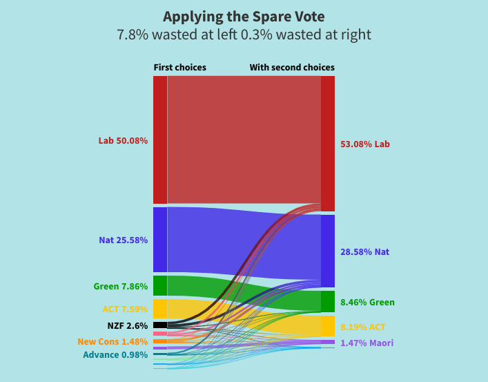
Here is a visualisation of how the Spare votes replaces wasted votes with votes for qualitying parties. It is based on 2020 General Election results
See how the wasted votes at bottom left are al;ost all replaced by intentional votes for qualifying parties at the right.
Data on the left is from 2020 General Election results. The transfers are just guesses ro show how second choice works.

Very interesting. But I’m more interested in how the seat allocation would have changed than in how the vote allocation would. That is, fewer votes might be ‘wasted’, but bugger-all change in seat allocation might also result. Can you add that to the illustration?
LikeLike
Hello John Thank you for your comment. I’ve just found the visualisation tool and trying it out. The effect on the seat allocation depends hugely on the leanings of those whose preferred party missed the threshold. If a party say of the left scored 4.9% then their second choices would lean left and might be quite significant. If that party had 5.0% of first choices, second choices would be less significant. And, as usual with visualisation tools, there are limitations. The big takeaway from that visualisation is that those wasted votes at bottom left are transformed so that almost every voter had a say in the make-up of parliament, as seen at the right. The dominant reason for the second choice of party vote is to remove the need for strategic voting and to almost eliminate wasted votes. Regards Ed
LikeLike